A Neo-Tudor 1990s Home in Westminster Goes Glam
Tennille Wood of Beautiful Habitat reveals her newly redesigned home.

Photo: Susie Brenner
When updating her home, Tennille Wood of Beautiful Habitat thought about color and pattern.
The result? Modern living spaces that evoke a playful elegance. Naturally, the home had beautiful bones and was the model home for a custom builder in the 1990’s. While there were stunning upgrades and millwork throughout, Wood tells Colorado Homes & Lifestyles that the redesign focused on creating a fresh look and feel.

Photo: Susie Brenner
What inspired the colorful accents and bold patterns? Was there a moment or image that set the direction?
TW:
Color
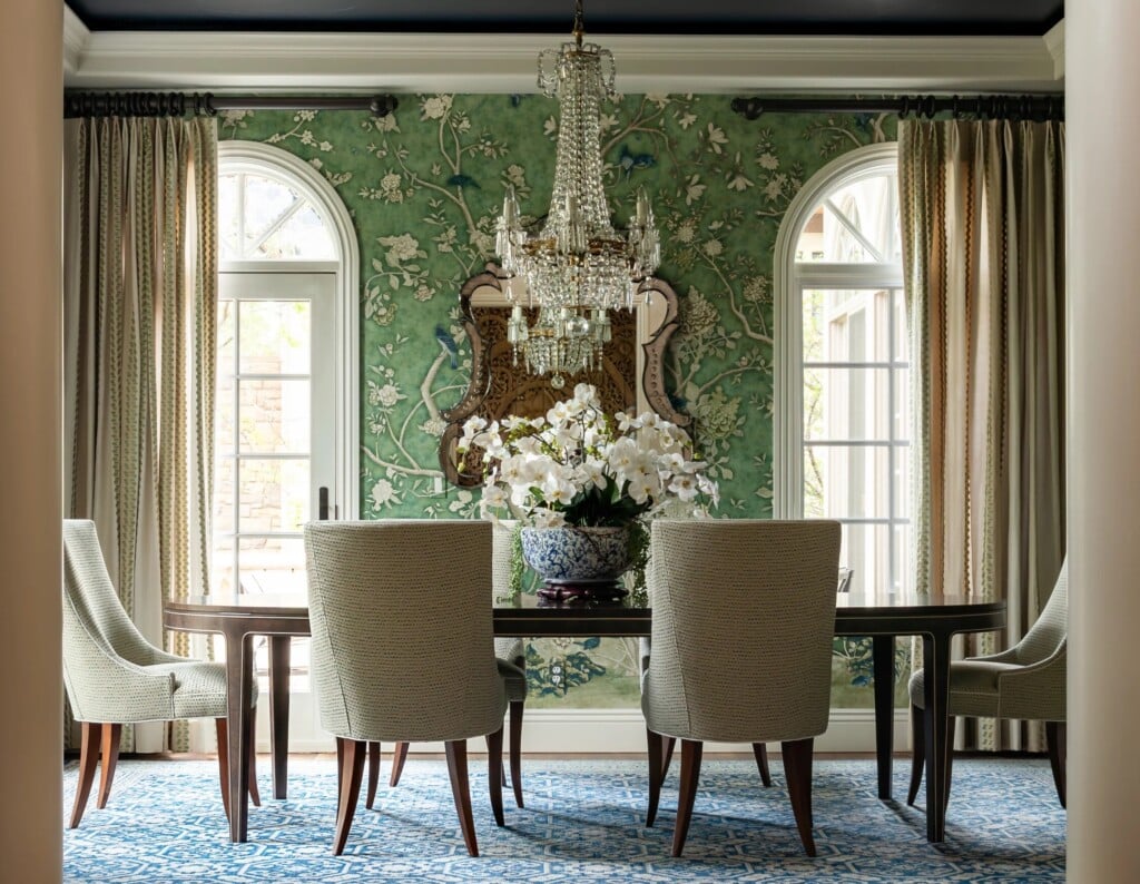
I’ve always been drawn to the whole spectrum of colors between emerald green and cobalt blue, and this home is a reflection of that love. You’ll find emerald cabinetry and millwork accented with cobalt blue in the library, lagoon-colored drapery and upholstery in the dining room, and peacock blue bedding in the primary bedroom.
The family room takes a different approach. The inspiration there came from a beloved cow painting that has been part of our collection for years. To complement the artwork, I introduced reds and yellows while still weaving in touches of blue-green accents to flow with the rest of the home.
Pattern
One of my personal mottos is that life is too short for solid fabrics. I love pattern—in my wardrobe and in my interiors. Pattern brings energy and personality to a space in a way that solids or textures simply can’t.
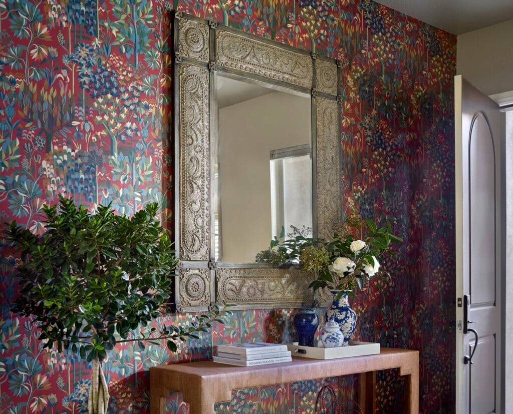
For the first twelve years we lived here, the living room walls were painted gray. While beautiful, they weren’t highlighting one of the room’s most distinctive architectural features: its curved walls. I wanted to draw attention to the curves, so we introduced patterned wallpaper that enhances the architecture while creating a bold moment in the first room you see. The bold black and white pattern draws the attention, so the rest of the room is a bit more subtle.
How did designing your own home compare to working with clients?
TW: Designing my own home is significantly more challenging than designing for clients. Part of the challenge is simply time. My clients receive my focused attention every day, while my own home is often worked on during evenings, weekends and stolen moments between projects.
Another challenge is awareness. As a designer, I’m exposed to thousands of beautiful products, materials, and possibilities. Knowing all the options can make it harder to commit because I can always envision another direction that would also make me happy.
The biggest difference, though, is emotion. When I work with clients, I can help guide them through decisions because I understand both the practical and emotional sides of the process while still being objective. In my own home, I don’t have that same distance. Every decision carries more personal meaning, which can make the process surprisingly difficult.

Photo: Susie Brenner
Texture plays a big role in this redesign. How did you approach layering materials to create cohesion across rooms?
TW: Texture is almost as important as color and pattern in creating a home that feels rich and inviting. Many of the patterns selected throughout the home have a woven quality that adds depth and texture to the pattern and color.
Creating cohesion is really about building relationships between rooms. While each space has its own personality, several common textural threads appear throughout: smooth leathers, warm wood tones, gold metal accents, soft upholstery, woven patterns and wool rugs. I also repeated design details, such as decorative trim on the drapery, to create moments of continuity. When these materials and details are layered consistently, the home feels collected and connected rather than designed room by room.
What surprised you most during the redesign?
TW: How difficult it was to select the wallpaper for the living room. I knew I wanted a pattern that would accentuate the room’s curved architecture, but I kept envisioning that the pattern needed color. Trying to balance a color combination on the living room walls that continued to work with the rest of the home was very difficult. What seemed like a simple decision became a months-long search involving countless samples, and even 3D modeling to understand how different patterns would look at scale.
In the end, I realized I was trying to force it. I let the need for colorful wallpaper go and instead used a strong black and white pattern – the Queen of Spain from Schumacher. The process reinforced something I often tell clients: the details that look effortless are usually the result of the most careful consideration.

Photo: Susie Brenner
If a homeowner wants to take one lesson from this redesign into their own space, what would you want it to be?
TW: The obvious answer is: hire a designer—it makes the process so much easier! But beyond that, there are two lessons I hope homeowners take away.
First, design with what you genuinely love. Trends come and go, but a home built around the colors, patterns, artwork, and pieces that bring you joy will always feel authentic and timeless. Second, look for opportunities to create repetition throughout your home. Repeating colors, materials, textures, or details from room to room creates a sense of cohesion that makes the entire home feel intentional and connected, even when each space has its own unique personality.
Words from the Designer

Photo: Susie Brenner
Tennille Wood shares exclusive insights into different spaces throughout her home project.
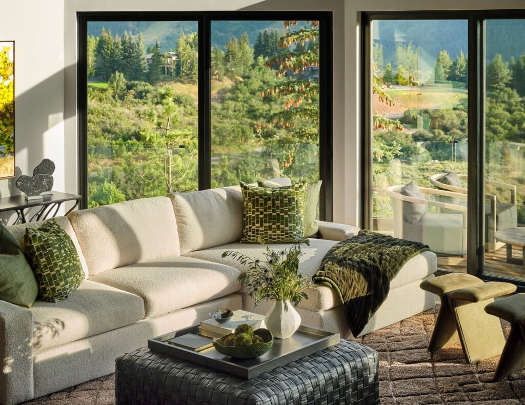
Living Room
In the formal living room, we added the Schumacher Queen of Spain wallpaper. The living room upgrades include curved walls. But the curves just disappeared with paint. Adding the patterned wallcovering helps to highlight the curves in three corners of the room.
Library
The original home office built-ins were cherry wood with a burgundy stain and were very 1990’s. As the room is not used as a home office, we created a home library. The new built-ins are a combination of emerald green paint and natural walnut. We continued the emerald green paint on the millwork, including wainscoting, window and door trim. The room is furnished with comfortable seating for reading or intimate conversation.

Photo: Susie Brenner
Family Room/Rec Room
The fireplace was updated from an old red brick surround to a contemporary design with reeded limestone tiles and a walnut mantel. So many homes use a linear fireplace and put the TV above. We intentionally sought something different and kept the fireplace and TV separated.
Dining Room
We emphasized the stunning millwork and upgrades from the model home by painting the layered tray ceiling. Instead of wallpapering the inside of the niche, we created 3 framed wallpaper panels.
Design Details
Interior Design: Tennille Wood, Beautiful Habitat Interior Design

Photo: Susie Brenner