8 Ways to Soften Up a Space
Basalt-based Interior Designer Karen White’s renovation of this 5,000-square-foot second home in Aspen came with one three-word missive: Warm it up.
“The house had a cold, stark feel,” she says of the architecturally significant home originally designed by Tim Hagman in 1992. “The owners loved the home’s general flow and dynamic architecture but they wanted a softer, warmer space.” The end product of this fast track 8-month project offers multiple ideas worth lifting. Here, we highlight a sampling.
1. CREATE A FLOW, USE CLASSIC PIECES
Nothing works better than open space and well-placed furniture to create definition without the use of walls. A bulky continuous hearth in front of the fireplace was removed for breathing room in the dining area. Porcelain tile from Decorative Materials was added to the fireplace wall to create depth and contrast with the rest of the room.
The custom sofas in the living room serve as a soft boundary to delineate the two areas shown here. The architectural light over the table is wood veneer that’s made in Spain. It has a single bulb that creates a really warm glow at night. The dining chairs are Saarinen and the warm white chairs in the living room are Minotti from Studio Como. When you look past the dining room, you’re seeing the mudroom vestibule that connects the garage to the kitchen. Beyond that is a view towards Independence Pass.

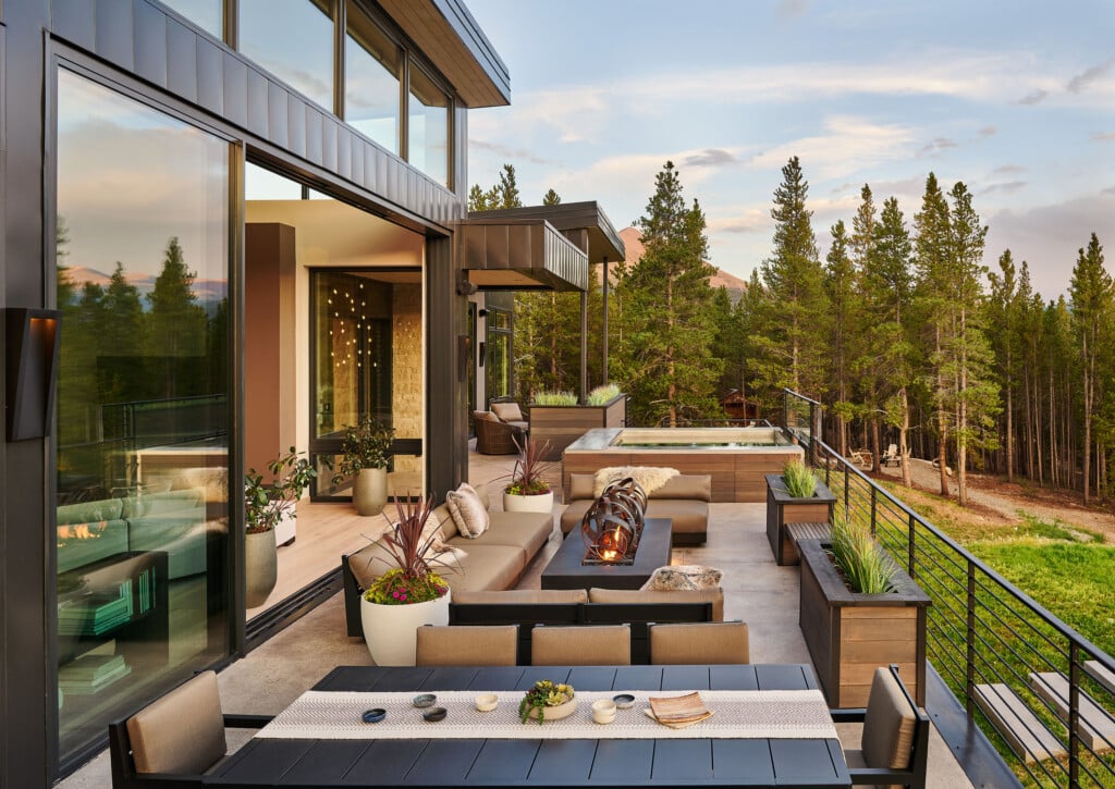
2. GIVE NATURE TOP BILLING
“The views are great. You can easily just walk right outside and sit on the deck even in the middle of winter or on a warm day,” says White, who did absolutely nothing to distract from the bounty outside. She designed the credenza in plain sawn black walnut with a chevron pattern. Instead of distracting from the view, it leads you to it.
3. HIDE THE TV
The credenza, built by VR Cabinet Makers in Carbondale has a second function: It hides the TV. Says White, “It was a way to satisfy all of their requests: They wanted to be able to watch TV, use their living room, and not have to go downstairs when there’s a game on, but they also didn’t want anything blocking the view.”

4. HIDE THE OUTLETS (AND DISGUISE THE TV)
The backsplash tile from Ann Sacks is Metro Glass in Overcast. “Getting the right color for the backsplash was not easy; we went through many tile samples before selecting this one,” says White, who designed plug molds recessed in the upper cabinets—a plug strip where the under-cabinet lighting is—in order to create a clean backsplash without any visible outlets breaking the pattern of the tile. The wood paneling atop the microwave nicely distracts from the TV, and the storage cabinet above hides its components. Warm colors and the quirky architectural pieces on the high shelf above the sink lend both personality and softness to the room.

5. TREAT THE MUDROOM WITH RESPECT
“There was nowhere to hang your jacket, no closet rod, no nothing,” White explains of the original interior. Not exactly the ticket for an active family of five. White created this wall-mounted cabinet so that everyone had their own drawer and their own basket. Shoes go underneath. The space was artfully reinvented with rustic sculptures and a collection of art cubes hung on the far wall. Three Herman Miller benches and a runner accentuate the clean architectural lines while providing the mudroom function. Muddy? Maybe. But definitley beautiful. (Not visible here: a two-door hanging closet, made of the same rift white oak as the cabinets.)
6. REUSE
White and her crew were able to preserve a lot of existing materials, especially on the exterior. They repainted the cementitious siding in a warm rich brown. The existing grey metal was in good shape so reusing that was an easy decision. “This was our start of the brown-grey theme throughout the home,” she says. “The windows and doors were of incredibly high quality, some of the most expensive you can buy, and very efficient. We really wanted to reuse those, so we just made the pale green cladding color work.”
7. MAXIMIZE ACCESS
The biggest thing that helped the flow of the exterior was adding a spiral staircase. Originally, it was necessary to go inside the house to get from the upper deck to the patio below. The connection was a challenge because there wasn’t room for a straight run of stairs. The creative team worked closely—general contractor Craig Barnes, landscape architect Julia Marshal and the owners—to develop the furniture and hardscape plan for the upper and lower decks and the placement of the fire pit.

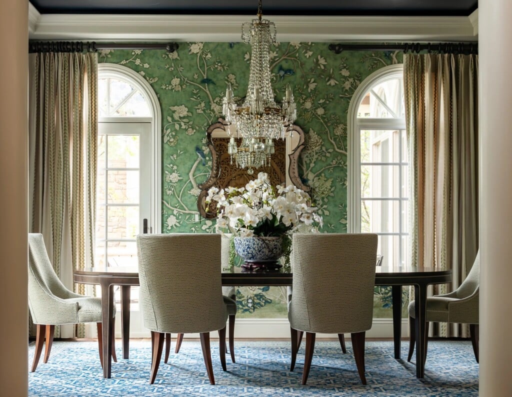
8. GREAT ART, HUNG WITH A BIT OF WHIMSY
The owners’ fun personality shines through their art. They bought it all, some from Aspen galleries. White helped with placement, including the Robert Longo painting in the dining room. Everyone who visits the house loves the squat red men, held in place with concrete screws, that float above the fireplace. The owners concur. Says White, “They love that they are fun and that they bring humor to the house.“
DESIGN DETAILS
INTERIOR DESIGN Karen White, Karen White Interior Design, Inc. GENERAL CONTRACTOR Craig Barnes, C. Barnes Construction