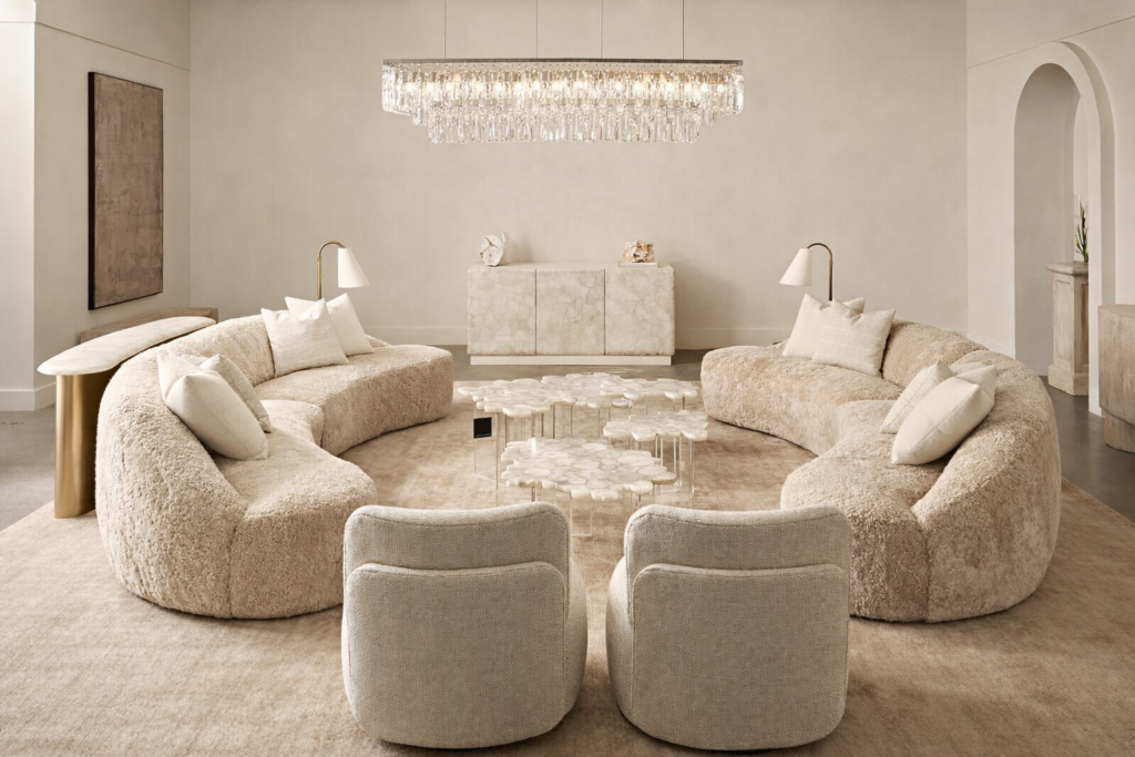
The Perfect Palette: Designers Reveal Their Favorite Hues
WE ALL SAY WE LOVE COLOR, but when it comes time to paint, the fear factor sets in. So CH&L asked several designers to give us their favorite go-to colors and mini-palettes for a foolproof dip of the paintbrush. “The best way to step away from bland without getting too dramatic is with medium-value colors that are soft and easy to live with,” advises CH&L’s art director, Elaine St. Louis. “Then once you get comfortable with color, you can have a little fun.”
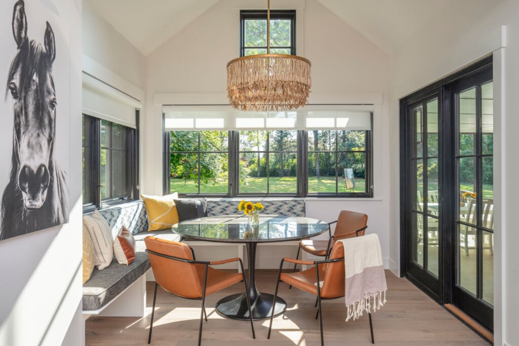
One common mistake is to choose a color based on a tiny printed card. Instead, buy a sample of the paint and try it out on the wall or poster board. Designer Mindy Sunday of Mindy Sunday Design in Denver always paints two opposing walls in big three-foot-by-five-foot swatches, then views them morning, noon and night with the changing light.
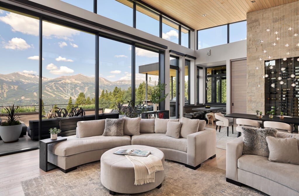
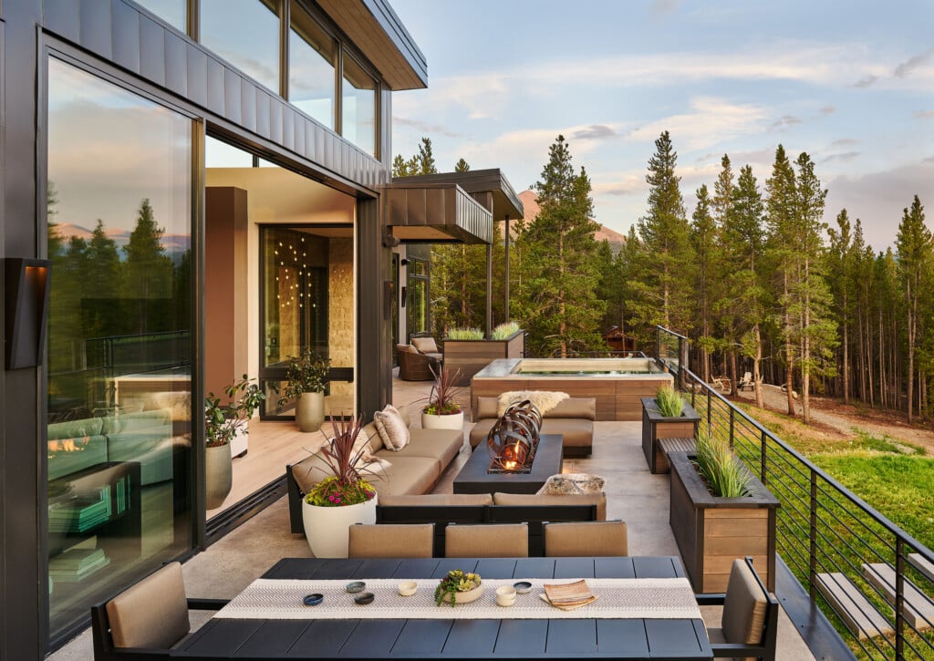
Our mountain-based designers go for bold looks with rich colors. “We live in an area with cold and snow for eight to nine months a year, so we need warm and soothing comfort colors,” says Dede Didighero-Tuso of Broadstroke Design in Frisco.
Known for her vibrant use of color, Kristi Dinner of companykd llc in Denver adds a final word of encouragement: “Don’t be afraid of color. It is the best, easiest transformation and impact you can make.” So if you’re ready for a change but not quite ready to embark on a full-scale remodel, check out these designers’ paint recommendations—and get inspired.
 High-Country Style: “Bosc Pear gives a wonderful, warm golden glow to a space,”
says Carrie Wolfer of Anne Grice Interiors in Basalt/Aspen. “Marooned has a little more glamour to it and works best in rooms with high ceilings.” She combines both colors with dark wood furniture, light neutrals or warm accent colors. Tranquil Turquoise: In honor of turquoise’s reign as Pantone‘s 2010 Color of the Year, Elaine St. Louis, CH&L’s art director, offers three variations of this inviting, luminous color. Mix these beautiful blue-greens with cream and chocolate browns or accessorize them with plum and apple green or orange.
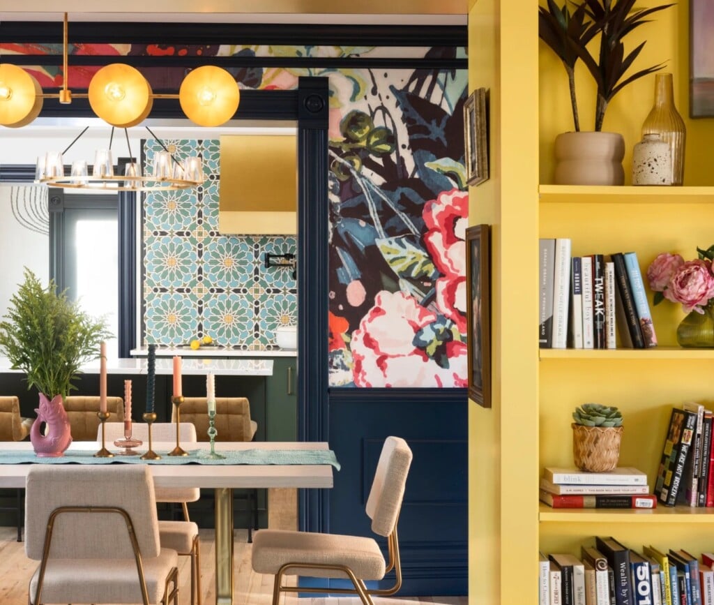
 Focus on Fuchsia: “This is a great combination for a teen or young adult’s room. “It doesn’t feel overly girly,” says Kristi Dinner, who used a similar fuchsia (Hot Lips 2077-30 by Benjamin Moore) in her interior design offices and paired it with graphic black and white for a sophisticated look.
 Dynamic Drama: “The charcoal makes the room come alive when paired with elegant gold and cream. It makes the most sensuous backdrop for art,” says interior designer Mindy Sunday, who used this combination in her own home. “Or try it with watermelon for another beautiful combination.”
 Earthy Elegance: Dede Didighero-Tuso combines these rich, full-bodied colors
with wood tones in mountain homes. “Mesa Tan has a warm, cozy feeling and coordinates with just about everything. It works well anywhere,” says Dede, who uses it on ceilings as well as walls.