Kitchens!
These four fabulously unique kitchens will make you swoon—
and turn your thoughts toward revamping your own space
2011 KITCHEN OF THE YEAR: LIVING LARGE
Perfect for both small gatherings and grand parties, our Kitchen of the Year was chosen for its unique style, high-quality materials and brilliant use of space
Where It Began
The homeowners of this completely reconstructed Boulder kitchen presented a tall order to designer Margie McCulloch. A kitchen and pantry that are almost the same size—one 260 square feet, the other 224 square feet—would both need to accommodate commercial-size appliances: Sub-Zero refrigerators, dishwashers, commercial beverage refrigerators, freezers, and ice makers. On top of that, they asked that the space have an Old-World feel but offer up-to-date functionality, and the materials had to be interesting, textural and top of the line.
Pulling It Together
To get the Old World look the owners craved, the cabinets were painted a Benjamin Moore Oregon Teal and distressed on site so the owner could approve the final look. Yellow-stained concrete counters add another textural touch, and old freezer handles were incorporated as hardware on the island cabinets. The elements jibe in such a way that they look charmingly old and yet
refreshingly new.
Beyond the unique details, McCulloch focused on function. “My goal in designing these two similar rooms—the pantry has all the same appliances as the kitchen except for the 48-inch Wolf range—was that they didn’t both look like kitchens,” the designer says, “so I made sure the two rooms served different purposes by using the pantry’s open shelves, shallow linen drawers and chicken-wire cabinets to store the majority of food and servingware.”
Style Tips
—The stainless capped island legs add stylish support. (One of the legs is actually a pullout that holds family games.)
—A floor-to-ceiling tile treatment makes a striking statement, and the three-dimensional tiles from Ann Sacks give the room another layer of texture.
—The counter on the pantry island is higher than standard to accommodate a commercial beverage refrigerator.
Design Details
Kitchen Designer: Margie McCulloch, Red Pepper Kitchen + Bath, redpepdesign.com

CLEAN AND CLASSIC
A dialed-back traditional white kitchen makes for the perfect family gathering spot
Where It Began
The original kitchen was designed 15 years ago with an emphasis more on function than beauty. By the time of the remodel, it was totally dated, with older appliances, beat-up cherry cabinets and a long narrow island with a bulky exhaust hood. “The client wanted to turn the utilitarian kitchen into a warm space that would act as the epicenter for her family of four,” says Angela Otten of William Ohs Showrooms, who was hired to help revamp the space. The homeowner, who had designed several spec homes prior to this remodel, came to the table with lots of interesting ideas for making the space functional and good-looking: an under-counter refrigeration unit that the kids could easily access, plus compartments in the main island for homework and crafts. Overall, says Otten, the client wanted the kitchen to look clean and classic, yet warm and comfortable.
Pulling It Together
For starters, Colorado Master Builders & Architects added several feet to the kitchen to accommodate a larger layout. Next, Otten chose integrated appliances to keep the lines and surfaces of the room clean—including a hidden pantry entrance between two refrigeration/freezer units. Finally, she designed an arched niche to highlight an etched turquoise china buffet (built new, but painted to look antique) that displays fine dishes and adds interest.
The range wall is a focal point with a stone-and-pewter hood and glass-paned wall cabinets. And three islands make up the center of the kitchen, each with a different purpose: the butcher-block island for prep work, with a cutting surface and prep sink; the center island for cleanup and casual dining; the third island for extra, easy-access refrigeration.
Style Tips
—Otten created a traditional, timeless kitchen by avoiding what she calls “fluffy details”—such as corbels on the islands—so that “your eye goes across the entire kitchen without getting stuck on any one detail.”
—Thoughtful, artistic touches such as the antique-inspired turquoise hutch, which was created with a time-
intensive painting and etching style, add personality and unique style to the space.
—On the island, the diamond-style pattern on the doors provides interest without being fussy. “We took cabinets with a very simple style and added detailing that catches your eye only slightly,” Otten says.
—Go easy on the stainless steel appliances. “To achieve a comfortable, warmer space,” says the designer, “use more wood, less metal.”
Design Details
Kitchen Designer: Angela Otten, William Ohs Showrooms, wmohs.com

PURE MINIMALISM
This modern kitchen makes a big statement with only a few materials
Where It Began
The clients’ goal was to replace their tired, cherry-stained kitchen with a sleek, minimalist design. The original space could best be described as quirky: “The island was at an odd angle and the countertops were a dark granite material that screamed ‘1980s,’” says William Landeros, CKD, of bulthaup Denver who, with colleagues Jed MacKenzie, CKD, and Sheila Fein took on the challenge of giving the space a much-needed facelift. “Our vision was to make sure that all of the strange details from the previous kitchen were reworked to make a cohesive, functional space without complicated angles or funny details,” Landeros says. To that end, they aimed for simplicity, clean lines and smart organization.
Pulling It Together
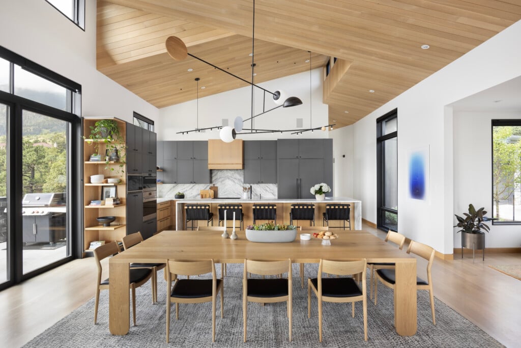
For the layout, the design team followed the original footprint but reconfigured cabinetry and wall details to avoid all those odd angles. For the cabinet faces, they chose grey anodized aluminum with silver aluminum edges, and to continue the minimalist theme, they opted for recessed handles on all top drawers and wall cabinets and bulthaup’s handle-free Touch system for the lower cabinets.
To fulfill the homeowners’ request for a maintenance-free countertop, almost-white CaesarStone called “Blizzard” was chosen. A cherry veneer bar top was added for casual gatherings with friends and family. “We selected a cherry finish so there would be some connection with the original flooring, and also a warm contrast with the gray cabinets,” Landeros says.
The homeowners didn’t want an obtrusive hood in the middle of the island, says Landeros, so they went with a Wolf downdraft ventilation system, which works perfectly with the Wolf induction cooktop. But the list of state-of-the-art appliances doesn’t stop there: a Gaggenau Steam Convection Oven and a Miele coffee system and dishwasher also joined the lineup.
Style Tips
—Hard, linear surfaces form the bones of this kitchen, so shapely contours were brought in for balance; Landeros recommends using oval-shaped lighting to soften the overall feel of the space.
—In a minimalist kitchen, it is important to use a carefully edited materials palette. “If we are using metal finishes and solid color countertops,” says MacKenzie, “we like to integrate some kind of warm material—in this case, the cherry bar top.”
—Another great tip for going streamlined is concealing hardware. As Landeros says, “This look is as minimal as you can get.”
Design Details
Kitchen Designers: William Landeros, CKD, Jed MacKenzie, CKD, Sheila Fein, bulthaup Denver by Kitchen Distributors, denver.bulthaup.com

HIDDEN BEAUTY
A dark, inefficient kitchen lightens up and conforms to the lifestyle of avid cooks
Where It Began
This Lonetree kitchen was once filled with black cabinets and wasted corner space. Not surprisingly, the owners requested light and efficiency. Serious cooks who keep a meticulous kitchen, they also wanted to eliminate all clutter. “Their primary request was that we find a convenient way to store all their pots, pans and lids so they could be easily accessed, but of sight,” says Bill Livingston, CKD, of Kitchen Distributors. Finally, they wanted the design to revolve around a 48-inch Wolf range they already owned.
Pulling It Together
A straightforward rectangular floor plan solved the problem of awkward corners. And to lighten the space, Livingston helped the family select white cabinets, a soft blue island and a large white farm sink—all clean-lined and bright without being stark. Then he gave them a copy of the floor plan and asked them to label where they wanted to store each and every pot, pan and lid. Livingston designed special drawers for the oversized pots and a separate slotted drawer for the lids—no more fumbling around for a matching set. Their love of Asian cooking inspired “garages” on either end of one counter where they can store cut vegetables that need to soak for hours. (Stainless mesh doors keep the air circulating.) A double-basin Franke sink can hold big pans on one side and a basin of soapy water on the other.
Style Tips
—An all-white kitchen can feel cold. Livingston’s choices of light blue for the island, as well as hints of blue in the granite and backsplash tiles, prevent things from feeling chilly.
—To keep the island from looking like a big rectangular chunk in the center of the kitchen, Livingston designed it wider at the ends than the middle. (It narrows by 1 1/2 inches at the center.)
—Not wanting the kitchen to look too traditional, the designer used contemporary hardware and faucets as well as a stainless steel hood over the range.
—The couple hates clutter, so Livingston designed a breakfast garage next to the refrigerator. Their coffee maker, all necessary utensils, and cereals take cover.
Design Details
Kitchen Designer: Bill Livingston, CKD, Kitchen Distributors, kitchendistributors.com


