Designers’ Color Obsessions for this Year
Warm neutrals and rich jewel tones make the cut in 2025
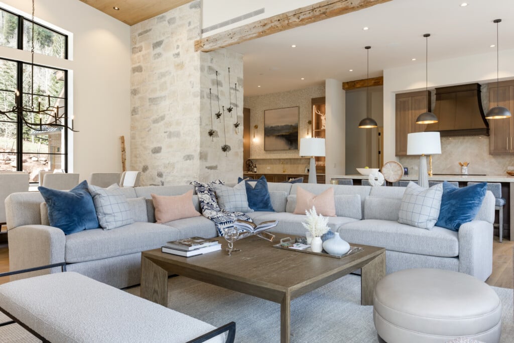
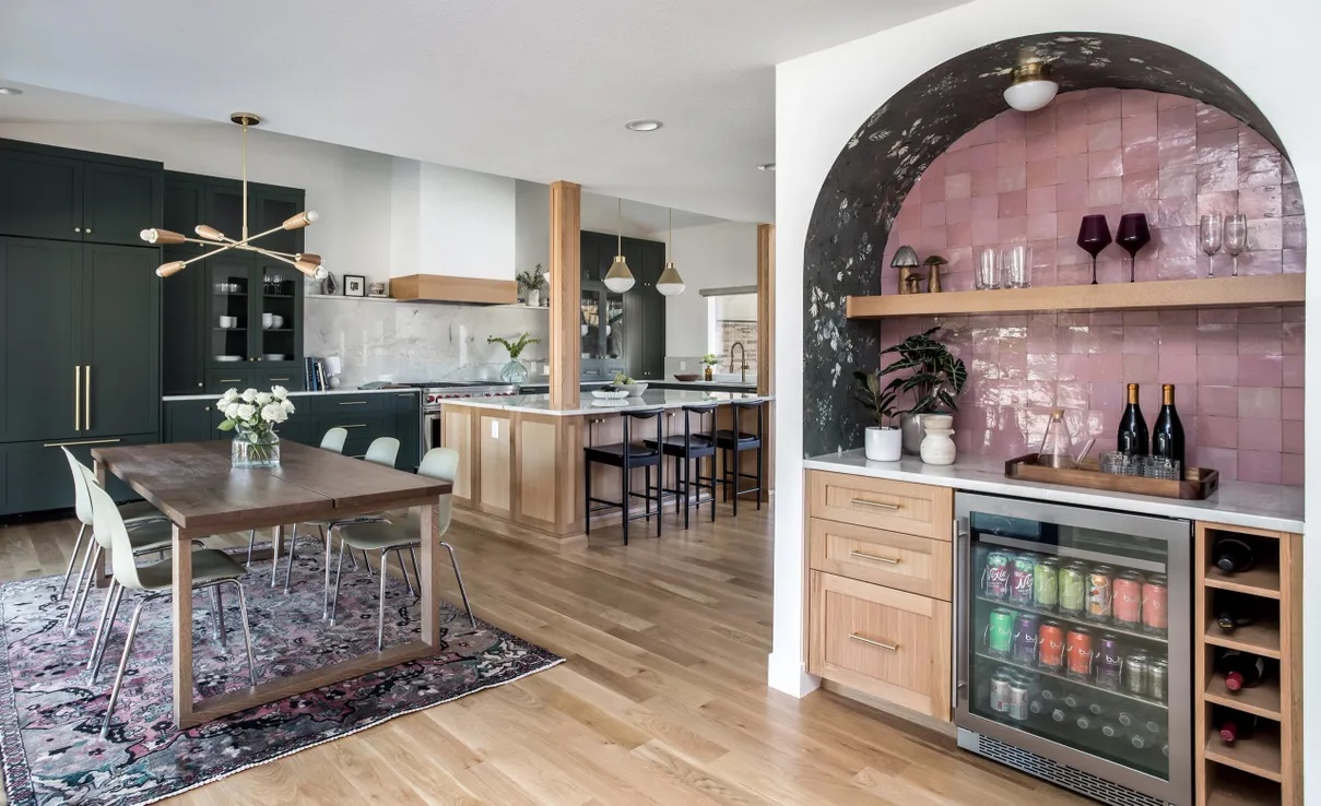
Coeur Cabinet Curated Interiors. | Photo: Emily Minton Redfield
A creative way to express personality and enliven and refresh your home’s interior design is with color. The Pantone Color of the Year program has crowned Mocha Mousse (Pantone 17-1230) the “it” color for 2025. A warm, rich brown, the hue suggests relaxed elegance, warmth and indulgence—think chocolate and coffee!
We asked some of Colorado’s notable area design professionals for their take on the 2025 color trends. Their advice can help whittle down color choices perfect for your home’s interior.
Elizabeth P. Lord Residential Design
Elizabeth P. Lord Residential Design. | Photo: MG Photography
Principal and Designer, Elizabeth Lord-Levitt, says she’s seeing and using deep earth and jewel tones this year. These include burnt oranges, dark sage greens, warm purples and mauves, and deep teal hues. “With the exposure to more inspiration photos online, homeowners are willing to take bigger chances with incorporating color into their spaces without sacrificing versatility,” she says. “Earth tones can allow contrast and accentuate a space without looking overpowering.”
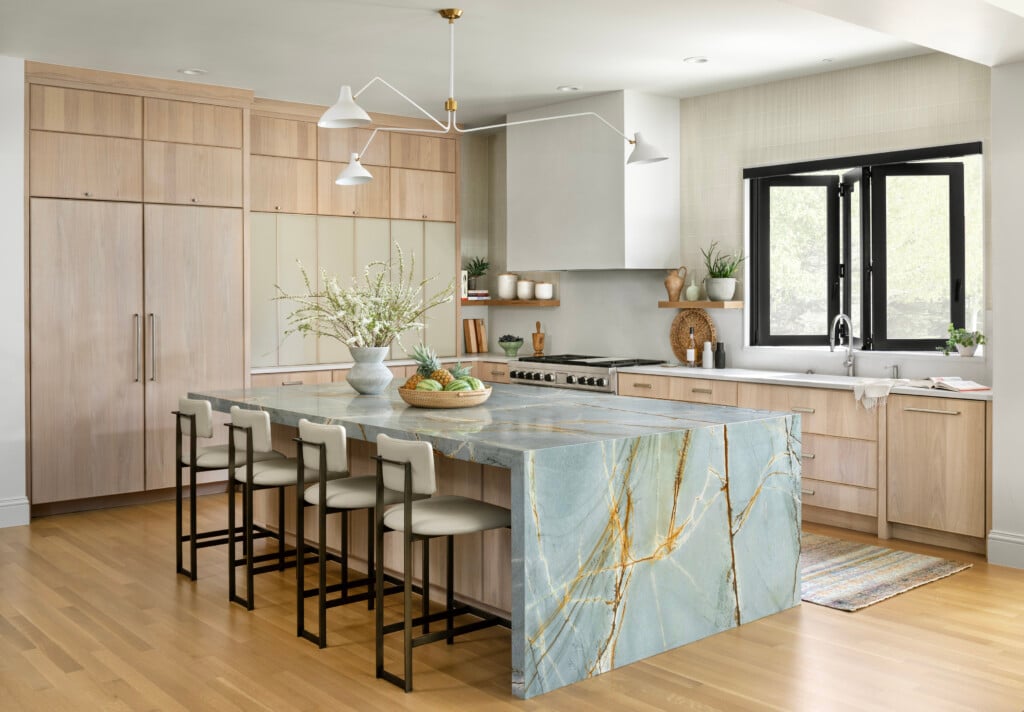
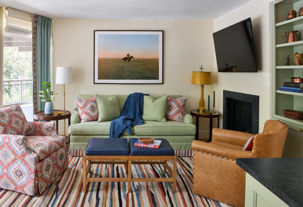
Coeur Cabinet + Curated Interiors

Coeur Cabinet Curated Interiors. | Photo: Emily Minton Redfield
Designer, Karina Martinez, notes that colors with warm undertones are making a splash in 2025. “Deep greens, tobacco brown, cinnamon, and warm shades of black are the colors we’re currently leaning into,” she says. “When warm colors are incorporated into a design palette, the result is rich, textural and timeless. We love adding warm shades to instantly add character to a design.”
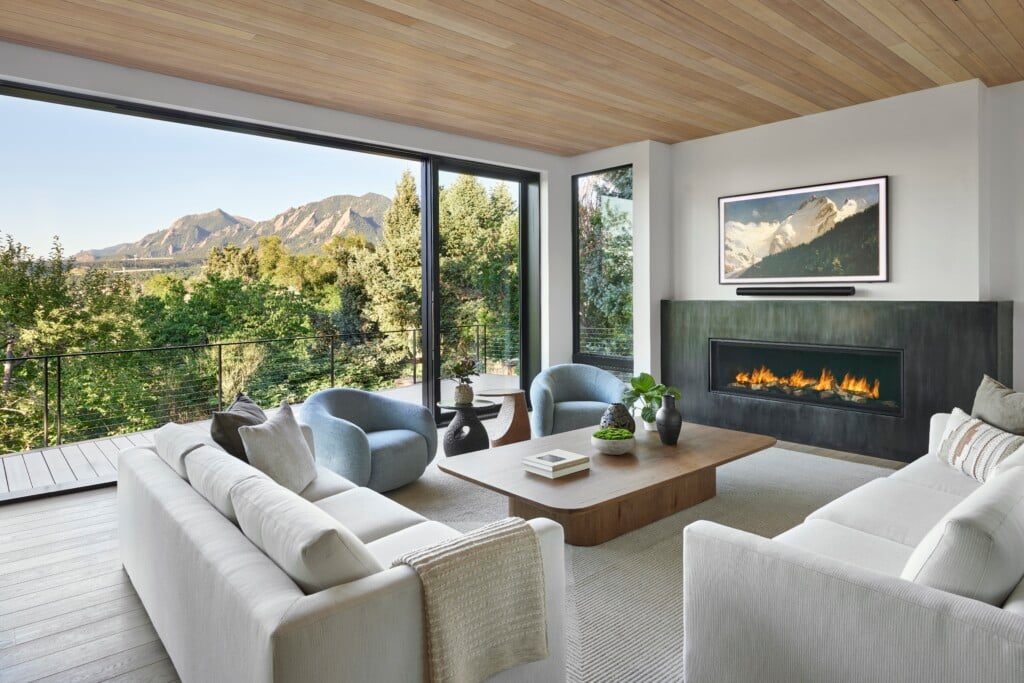
Dado Design

Dado Design. | Photo: Ian Warren Photography
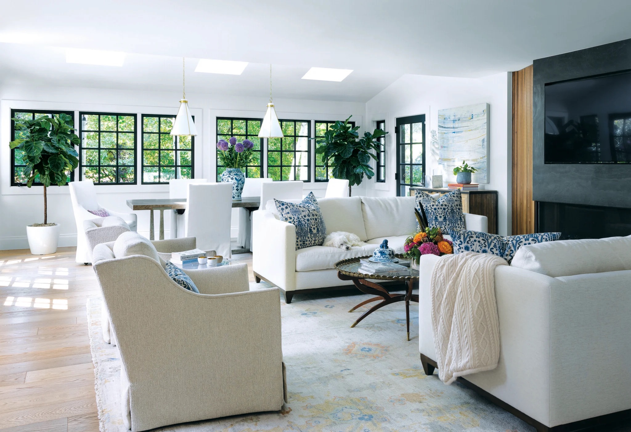
Embracing a slightly different approach to color accents, Megan Moore, founder and principal at Dado Design, says she doesn’t usually use pops of color. “Instead,” she explains, “I tend to work with neutral, muted palettes.” Moore likes shades of browns, olive greens, beige and nude undertones, and muddy, charcoal tints. Her design technique makes the most of saturated, earthy tones to give depth to her designs and curate spaces that feel grounded.
Studio Amell

Studio Amell. | Photo: Jess Blackwell Photography
“No doubt, soft and warm neutrals are timeless color selections that are here to stay,” says Studio Amell Owner and Design Director, Chelsea Amell. “Introducing rich, jewel-toned accent colors is a current an impactful design trend that adds character to interior décor.”
Amell explains that vibrant accents pair well with a neutral foundation, helping to add contrast and interest. Rich reds, terracotta, deep olive greens, moody blues, warm golden yellows, and blush and mauve accents are popular choices. “The key is balance and combining harmonious pairings of tone and contrast,” notes Amell. “A space can feel unique and bespoke mixing intentional colors and patterns.”